Choose website colours for a Darwin brand
Choose a practical website colour palette for a Darwin business. Give colours clear roles and check readable text, buttons and form states.
 Robert TicknerWeb design and local SEO
On this page
A colour palette gives the website a recognisable identity. Its practical job is also to separate sections, make text readable and help customers recognise the actions they can take.
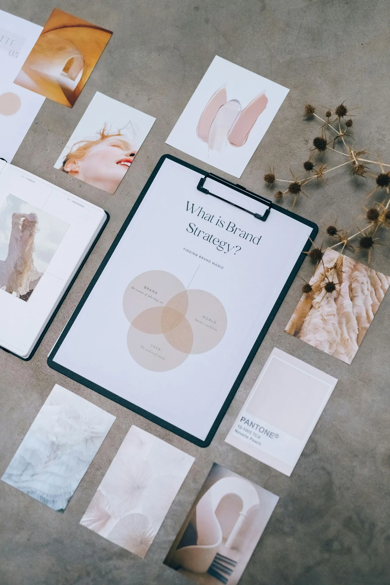
A Darwin brand can use warm ochre or sandy tones without relying on broad claims about how a colour makes every person feel. Start with your existing identity and test the palette in real page layouts.
Give each colour a clear role
Choose a light page background, a main text colour and a signature colour for selected actions or accents. Add supporting shades only when they have a purpose.
That role system helps new pages stay consistent. It also makes it easier to change the palette later without redesigning every component separately.
Test text on its actual background
Check headings, body text, links and small labels where they appear. A readable colour on white may be difficult to read over a photograph or a gradient.
Use a contrast checker and review the page visually. W3C’s contrast guidance explains the text contrast requirements. Check normal and hover states, rather than testing one colour pair only.
Make actions easy to recognise
Give primary buttons a consistent appearance and clear wording. A darker ochre can work well with white button text when the contrast supports it. Secondary actions can use a lighter treatment.
Do not rely on colour alone to explain errors or selected options. Include text, labels or other visible indicators so customers understand the state.
Keep content imagery in view
Your palette should work beside real project and team photos. A strong background can compete with detailed images, while neutral space lets the work speak clearly.
Use the website brand brief to record image direction and colour roles together. Review examples from the business rather than testing only polished mockups.
Document the palette for updates
Keep the approved colour values and component examples in a short guide. Staff and future designers should know which colours belong to buttons, text and backgrounds.
Our custom Darwin website design connects colour choices with layout and readability. The finished palette should support the customer task as well as the brand.
Robert Tickner
Web designer, Web Design Studio Darwin
Robert helps businesses plan clear websites, useful service content and practical enquiry routes. He connects the website brief with the customers and work the business wants.
Published .
Business examples are illustrative; they are not reported client results.